SAP SuccessFactors Training | SAP SuccessFactors Certification Course Online
Trusted by 20,000+ professionals across India, the US, and Middle East.
SAP SuccessFactors Certification Training
At UnoGeeks, our SAP SuccessFactors Training is designed to make you project-ready and placement-focused from day one. With cloud-based HR implementations rapidly expanding across global enterprises, the demand for skilled SAP SuccessFactors consultants specialising in Employee Central, Recruitment, Performance Management, Compensation, and Talent Management continues to grow rapidly worldwide.
SAP SuccessFactors professionals today command strong salary packages, with freshers securing competitive entry-level roles and experienced consultants earning high-paying positions in top consulting firms and MNCs. Our training goes beyond theory with real-time HR process implementations, end-to-end workforce lifecycle scenarios, interview preparation, and live project-based learning to make you fully job-ready.
By the end of the program, you won’t just understand SAP SuccessFactors — you’ll be ready to crack interviews and step into real SAP SuccessFactors implementation roles with confidence.
Our Students Work At


For Quick Questions
SAP SucccessFactors Videos
Get Course Full Syllabus
SAP SuccessFactors Training Course Details
About SAP SuccessFactors
SAP SuccessFactors is a leading cloud-based Human Experience Management (HXM) solution that helps organizations manage their core HR processes, employee lifecycle, talent management, and workforce planning on a single integrated platform.
It enables organizations to streamline HR operations, improve employee experience, automate HR processes, ensure compliance, and make data-driven workforce decisions using SAP’s modern cloud architecture.
Key Features & Capabilities
• Employee Central (Core HR) – Manage employee data, job structures, and HR processes
• Role-Based Permissions (RBP) – Secure access control and user authorization management
• Data Models & Business Rules – Configure HR processes using MDF and rule frameworks
• Position Management – Manage organizational hierarchy and workforce planning
• Workflow & Notifications – Automated approval workflows and alert mechanisms
• Time Off Management – Leave, holidays, accruals, and absence management
• Data Integration & Synchronization – HRIS integration and data migration handling
• Custom MDF Objects & UI Rules – Extend system functionality using MDF configurations
Become a Certified SAP SuccessFactors Consultant
Looking to build a high-paying career in SAP SuccessFactors (HXM)?
Join UnoGeeks’ Best SAP SuccessFactors Training Online Program — trusted by professionals and recognized as one of the top SAP SuccessFactors training institutes in the market.
We focus on real-time HR implementations, certification guidance, and job-oriented skills — not just theory.
What You Will Learn
• Introduction to ERP, SAP, R/3 architecture & S/4HANA basics
• SAP SuccessFactors navigation and core concepts
• Employee Central configuration and Role-Based Permissions (RBP)
• Data Models, Business Rules, and Picklist configuration
• Position Management and organizational structures
• Workflow setup, alerts, and custom email notifications
• MDF (Metadata Framework) objects and UI rules configuration
• Data loads, HRIS synchronization, and integrations
• Time Off configuration – holidays, accruals, workflows, and rules
• Hands-on SAP SuccessFactors Live Project implementation
• SAP SuccessFactors certification guidance and exam preparation
• Resume building + mock interviews with personalized feedback
• Job readiness support with regular SAP SuccessFactors job openings and referrals
🔔 Daily SAP Job Alerts by UnoGeeks
Follow us on LinkedIn for real hiring updates:
👉 UnoGeeks SAP Jobs & Placement Updates
Who Can Enrol in This Course?
• IT professionals looking to transition into SAP SuccessFactors consulting
• HR professionals aiming to move into SAP HCM / SuccessFactors roles
• Graduates & post-graduates seeking high-growth IT careers
• Freshers looking for high-paying SAP HR domain opportunities
Prerequisites
No prior SAP or HR experience required.
We cover all foundational concepts as part of the training:
• Basics of SAP and ERP systems
• Core HR and business process concepts
• Employee lifecycle and HR operations understanding
Register for a Free Demo
SAP SuccessFactors Training Course Curriculum
- Introduction to SuccessFactors Core Concepts
- Success Factor HCM-System and Various modules in SF
- SF Certification Exam and Delta Process and Learning Hub Functionality
- Difference Between Provision and Instance System
- Success Factor -Basic Navigations
- Password Functionality
- Upload LOGO Options
- Proxy Settings
- Language Options
- Theme Settings
- Knowledge Based Articles
- Upgrade Center Functionality
- Success Factor Employee Central Introduction
- Where to find information of EC Topics
- Implementation Sequence
- Creation of Super Admin
- Setting Up the EC Environment
- Turning on Enhanced Features in Employee Central
- Managing User Access
- Managing Security Using Role-Based Permissions (RBP)
- Permission Group and Permission Role
- Creation of Employee, Manager and Admin Role
- Data Model Overview
- Setting up Corporate Data Model, XML Examples (Foundation Objects)
- Setting up Corporate Data Model, XML Examples (Person and Employment Objects)
- Setting up Country Specific Field (CSF) Corporate Data Model, XML Examples
- Setting up Country Specific Field (CSF) Succession Data Model, XML Examples
- Working with Foundation Objects
- Characteristics of Foundation objects
- Associations between objects
- Creation of Event Reason
- Propagations using Business Rule
- Defaulting and Error Message through Business Rules
- Creation of Business Rule with Various Examples
- Setting Up Business Rule
- Generation of Automatic Employee ID through Business Rule
- Introduction to Picklist
- ECV2/Legacy Picklist
- MDF Picklist
- Cascading Picklist
- Enable Position Management
- Position Related Permissions
- Automatic Generation of Position Code
- Creation of New Positions
- Synchronization of Position and Job Information
- Position Org Chart Quick Card Configuration
- Mass Position Creation
- Check Tool
- Integration with Different Modules
- Provision Settings and permissions.
- Defining Workflows
- Defining Alerts
- Define Notifications
- Scheduling a Job
- Custom Email Template
- Custom Place Holders
- Mapping the Custom Place Holders
- Creation of Custom Object
- Authorizations
- Assignment of Custom at Employee Level
- Configuring Ul
- Configuring People Profile
- Creation of Custom Ul Rules
- Assignment of Ul Rules
- Port let Information
- HR Transactions (Hiring, Transfer, Rehire and Terminations)
- Payment Information and validations
- Foundation Data Loads
- Employee Data Loads
- Mass Changes
- HRIS Synchronization
- Instance Synchronization
- Global Assignments
- Concurrent Employment
- Tile Creation
- Text Replacement
- Hire Date Correction
- Check Tool
- Standard and Custom Reports
- Manage Home Page
- Purging User’s
- Data Model’s Comparison
- An introduction to Time off
- Enabling Time off in Provision
- Permissions in Time Off
- Setting up Employees in Time Off
- Workflow in Time Off
- Holidays
- An introduction to Time off
- Enabling Time off in Provision
- Permissions in Time Off
- Setting up Employees in Time Off
- Workflow in Time Off
- Holidays
- Work Schedules-Simple, Period and Schedule
- Time Types
- Time Account Types
- Time Profile
- Country Specific Time Off
- Email Notifications
- Time Alerts
- Manage Time Off Structures
- Time off Reporting
- Leave of Absence
- Business Rules: Hire Rule
- Business Rules: Accrual Rule
- Business Rules: Termination Rule
- Business Rules: Period End Process Rule
- Business Rules: Interim Rule
- Business Rules: Take Rule
- Implement SAP SUCCESSFACTORS for a Live Project.
- Understand the requirement and come up with config workbooks.
- Configure SAP SUCCESSFACTORS as per config workbook.
- Implement SAP SUCCESSFACTORS Modules as per Config Workbooks
- Test the setups.
- Explain various SAP SUCCESSFACTORS Certification Options
- Discuss Important SAP Certification Exam Questions
- Prepare for SAP SUCCESSFACTORS Certification
- Prepare Crisp Resume as SAP SUCCESSFACTORS Specialist
- Discuss common interview questions in SAP SUCCESSFACTORS
- Provide Job Assistance
🎥 Watch How We Teach SAP SuccessFactors
🎓 Learn From Our Most-Watched real-time SAP SuccessFactors Sessions
For Quick Questions
SAP SucccessFactors Videos
Get Course Full Syllabus
SAP SuccessFactors Trainer – Industry Expert for SAP SuccessFactors at UnoGeeks

100+ Live Batches Delivered
2000+ Professionals Trained
20+ Years SAP SuccessFactors Experience
Mr. Rajesh is the Lead SAP SuccessFactors Trainer at UnoGeeks and a seasoned industry expert with over 20+ years of experience delivering complex SAP SuccessFactors and HCM cloud implementations for top US-based product companies and global consulting firms.
He specialises in end-to-end SAP SuccessFactors functional training, guiding professionals through real-world implementations of Employee Central (Core HR), Role-Based Permissions (RBP), Position Management, Workflows, Business Rules, MDF (Metadata Framework), Time Off, and HRIS integrations, along with data migration and system configuration.
Having worked on large-scale HR digital transformation programs across multinational organizations, Mr. Rajesh brings deep implementation expertise into every session. His hands-on, project-driven approach ensures learners gain practical exposure to real-time HR processes, employee lifecycle management, system configurations, compliance frameworks, and cloud-based HR solutions — enabling them to confidently step into SAP SuccessFactors consultant roles and excel in real client projects and interviews.
Earn Your SAP SuccessFactors Certification with Confidence
Showcase your expertise with an official certificate recognized by employers.
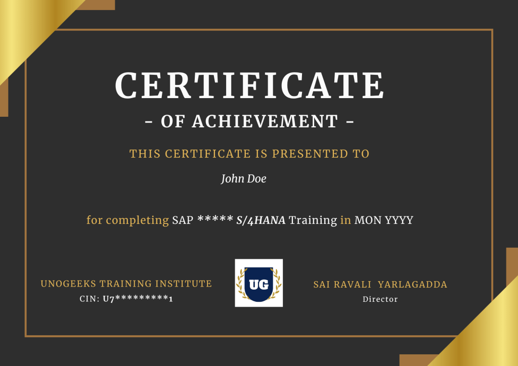
UnoGeeks Sample SAP Certificate
🎓 Official Certification
Earn an official course completion certificate validating your practical SAP SuccessFactors expertise
🔗 SAP FICO S/4 HANA Certification
You will easily clear SAP SuccessFactors Certified Application Associate exam
🌍 Industry Recognition
Strengthen your resume with widely recognized credential trusted by employers and consulting firms.
🚀 Career Advancement
Gain hands-on SAP SuccessFactors skills that help you stand out & advance in your career
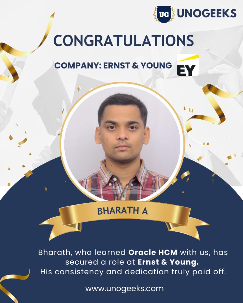
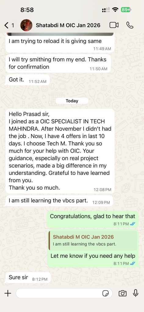
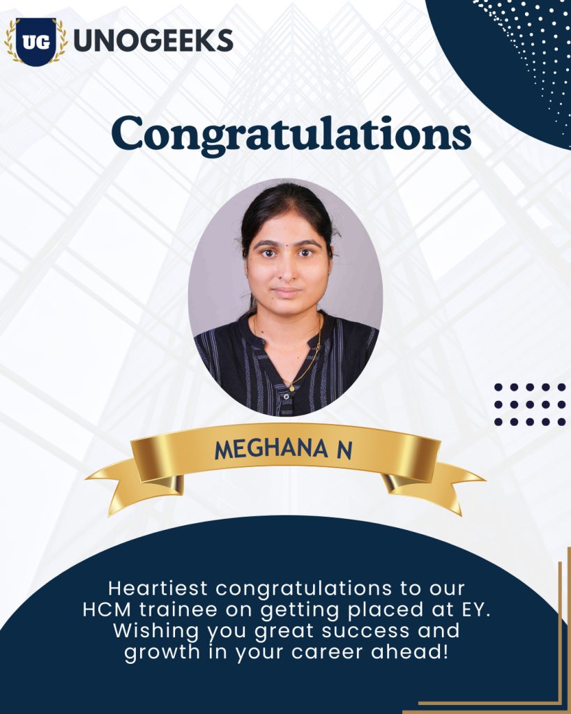
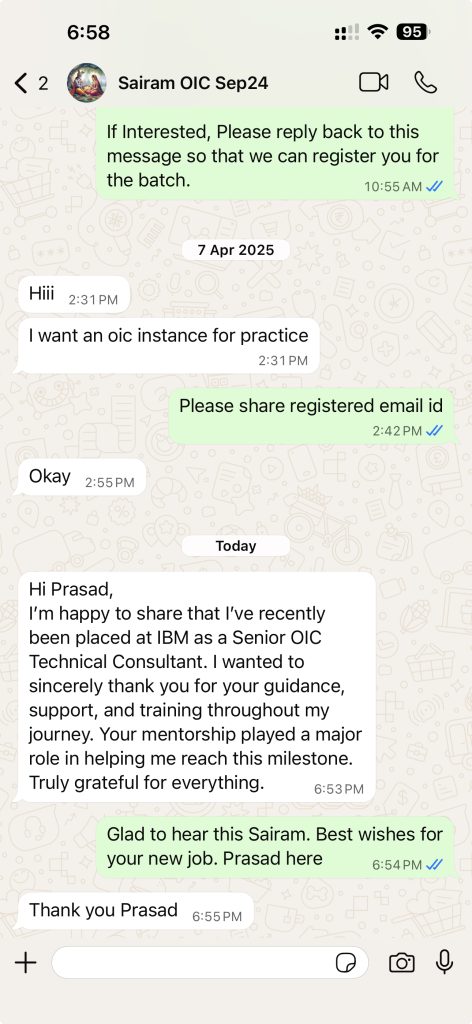
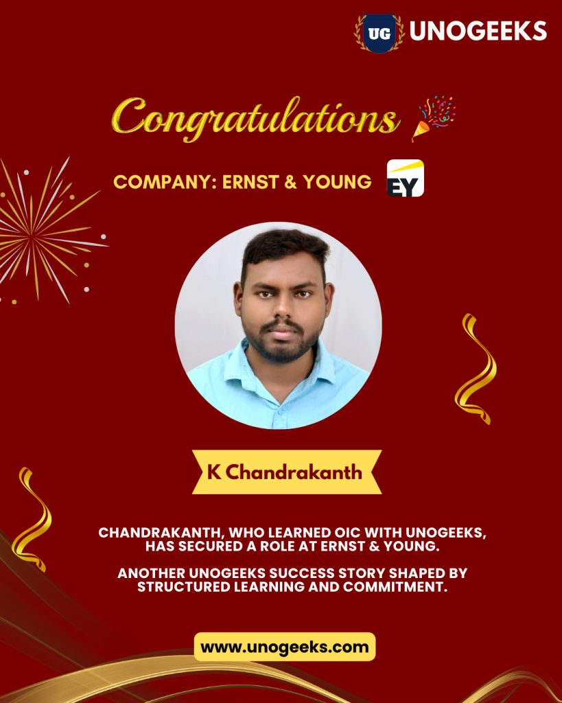
Few Success Stories from Our Students ✅
✅ “Recent real placements & live student messages (updated regularly)”
SAP SuccessFactors Consultant Jobs & Salary Trends
📈 High Market Demand
SAP SuccessFactors skills are in strong demand as organizations worldwide shift towards cloud-based HR systems to manage their workforce efficiently. With increasing adoption of SAP SuccessFactors Employee Central, performance management, and talent solutions, companies require skilled consultants to handle core HR processes, employee lifecycle management, and HR digital transformation
🏢 Used by Global Firms
Leading organizations across banking, manufacturing, healthcare, retail, IT services, and multinational enterprises rely on SAP SuccessFactors to manage mission-critical HR operations. SuccessFactors consultants play a key role in implementing end-to-end HR processes, including Employee Central, Role-Based Permissions, workflows, and integrations — ensuring compliance, automation, and seamless workforce management across global environments.
💰 Attractive Salaries
SAP SuccessFactors consultants earn highly competitive salaries worldwide, driven by strong demand for professionals with real-time implementation experience and functional expertise. Freshers can secure high-growth entry-level HR cloud roles, while experienced consultants consistently command premium compensation packages in top consulting firms, MNCs, and global HR transformation projects.
Our Training Advantage

Learn from Certified Experts
Get trained by Industry-Certified professionals with deep real-world Oracle Cloud implementation experience

Real-Time Implementation Projects
Learn through real project scenarios that mirror actual client implementations & production use cases.

Interactive Live Training Sessions
Highly interactive live sessions with recordings provided, so you never miss a discussion.

Resume, Interview & Job Assistance
Guidance on resume building, interview preparation, and job support tailored to Oracle Cloud roles

Live Demos Before Enrolment
Attend up to 3 live demo sessions to evaluate the trainer, content quality, and teaching approach

24×7 Learning Support
Prompt support for queries, doubts, and technical issues throughout your learning journey.
What Students Say on Google
⭐ Rated 4.8★ by 600+ Google Reviews
Trusted by hundreds of professionals across Oracle Cloud domains
Free Career Call – Talk to Our Training Experts
Get batch details, syllabus, demo schedule, and fee structure — no obligation
+91 73960 33555
Get Batch Dates, Fees & Demo Details
+91 73960 33555
Mon–Sat | 6 AM – 10 PM IST
info@unogeeks.com
For detailed queries
Live Chat
Chat with our support team now
Trusted by 5,000+ learners | 500+ real-time batches completed
Why Students Trust UnoGeeks
500+
Real-Time Batches Completed
5000+
Happy Students
5 *****
Star Ratings
20+
Expert Trainers
SAP SuccessFactors Training 2026 Batch Slots
WeekDay Batch 1

Monday – Friday

07:00 – 08:15 AM (IST)
WeekDay Batch 2
Monday – Friday
08:15 – 9:30 AM (IST)
WeekDay Batch 3
Monday – Friday
07:00 – 08:30 AM (IST)
SAP SuccessFactors Training 2026 FAQs
SAP SuccessFactors is a leading cloud-based HR (HCM) solution used by global companies to manage employee data, payroll, performance, and recruitment. Learning SAP SuccessFactors opens doors to high-paying HR tech roles because companies are rapidly moving from traditional HR systems to cloud platforms.
Yes — it’s one of the fastest-growing SAP modules. With increasing adoption of cloud HR systems, professionals with SAP SuccessFactors training are in high demand across India, the US, and the Middle East.
A complete SAP SuccessFactors course typically covers:
-
Employee Central (Core HR)
-
Role-Based Permissions (RBP)
-
Business Rules & Workflows
-
Position Management
-
MDF Objects
-
Time Off & Leave Management
Plus hands-on configuration and real-time project scenarios.
Most SAP SuccessFactors training programs take 6–8 weeks, depending on depth. With daily practice and live sessions, you can become job-ready within 2 months.
Yes. Even freshers can learn SAP SuccessFactors, especially Employee Central. However, basic HR knowledge or interest in HR processes will help you understand concepts faster.
SAP SuccessFactors certification validates your skills in modules like Employee Central. It proves to employers that you can work on real-time SAP HR projects.
The SAP SuccessFactors certification cost typically ranges between ₹40,000 – ₹60,000, depending on region and SAP exam policies. Training institutes usually provide guidance but certification is done through SAP.
The most in-demand module is:
👉 Employee Central (EC)
It is the foundation of SAP SuccessFactors and mandatory for most jobs.
No. SAP SuccessFactors is mostly functional, not coding-heavy. You will work on:
-
Configurations
-
Workflows
-
Business rules
Some technical knowledge is useful but not mandatory.
-
Freshers: ₹4–8 LPA
-
2–5 years: ₹8–18 LPA
-
Experienced consultants: ₹20L+
With real-time project experience, salaries grow quickly.
Yes, SAP SuccessFactors training online is very effective if it includes:
-
Live sessions
-
Real-time scenarios
-
System access
-
Trainer support
Avoid only recorded/self-paced courses if your goal is a job.
No — SAP SD is a functional module, so coding is not required.
However, basic understanding of how SAP works and how modules integrate will help you grow faster.
There are no strict prerequisites. However:
-
Basic HR knowledge (optional)
-
Interest in business processes
-
Willingness to learn cloud applications
After completing the course, you can apply for:
-
SAP SuccessFactors Consultant
-
HR Systems Analyst
-
Employee Central Consultant
-
HR Functional Consultant
No. Compared to technical SAP modules, SuccessFactors is easier because it focuses on business processes. With proper guidance, anyone can learn it.
It is the most popular SAP SF certification that proves your expertise in:
-
Core HR
-
Data models
-
Workflows
-
HRIS configuration
It is highly valued by employers.
A good training program should include:
-
Live implementation scenarios
-
End-to-end employee lifecycle setup
-
Hands-on configuration
This is critical for cracking interviews
Look for:
-
Trainer with real project experience
-
Live classes (not recordings)
-
Resume + interview support
-
Real-time project exposure
Avoid institutes that only teach theory.
Yes. Many professionals from HR, MBA, BBA, or even non-IT backgrounds successfully switch to SAP SuccessFactors careers.
A good institute should provide:
-
Resume preparation
-
Mock interviews
-
Real interview questions
-
Job referrals / guidance
This significantly improves your chances of getting placed.